
Project concept
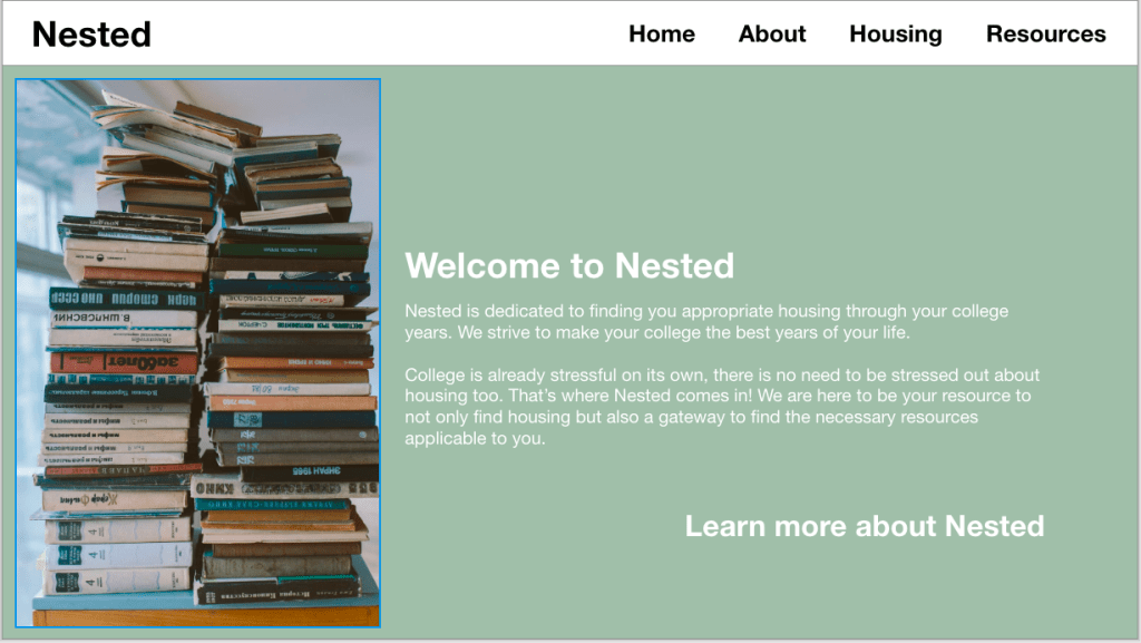
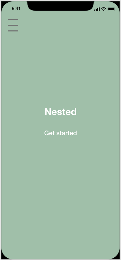
Nested is a platform designed to simplify and enhance the home-buying process, making it more user-friendly. The app provides resources and links for users who may find the home-buying journey confusing, allowing them to compare pricing within their budget. Additionally, Nested offers a feature where users can save past searches for easy retrieval at any time. The overarching goal of the app is to eliminate the intimidating and complex aspects of purchasing a new home, providing a more understandable and enjoyable experience. Nested is specifically crafted for individuals new to the housing market, offering a user-friendly approach to finding a new place to call home.
Design team
Kayleen Lawson: https://kayleenlawson.com
Payton Dierks: paytonaugusta.design.blog
User research synthesis
Demographic
We focused on the ages of 18-25
Most were either full time students or part time
All shared a common worry about finances
All were either working part time or full time
None of them lived alone either with roommates or with their parents
Qualitative insights:
- Users did not have trouble logging into the app
- Users became quickly interested in what the app has to offer
- Users understood on where to find things in the app
- Users were more energetic to find different housing methods
- “If it was this easy and simple I would be more likely settle faster”- Bennett
- Users were optimistic about find results
Quantitative Insights:
- Users spent more time putting in information and searching for housing than anything
- Users were adding more options to the save menu for later
- Users were very focused on the amount they wanted to spend
- Users spent a lot of time clicking on what other things the app offers
Users overall understood how to use the app and the functions it offered. About half of the group struggled in the beginning with the flow from screen to screen. They would click somewhere and get confused on how to get back to the main search screen. The resource page needed to be updated because users wanted a way to ask questions or have a search option for the links in the resource page. Right away we noticed users would speed through the app until something caught their eye or they were confused on a function. Almost every person at some point had to stop and ask a question about the app’s function. Some questions were “how did I get to this screen and how to I get back”, “do the links bring me to a different site or is it still on the app”, “can you edit your saved results once you already submitted your personal information”. What we noticed from observing users using the app is that they needed us to be there to answer their questions. We took notes on what parts the users struggled with and went back to fix it so the app experience was more seamless.
Proto-persona
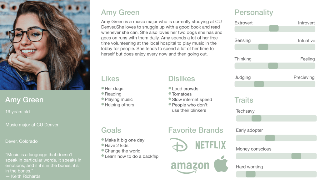
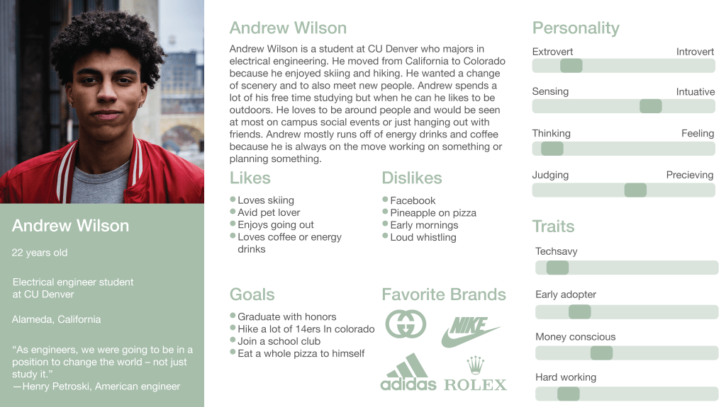
These two people are the type of people we are gearing toward to be using our app. Both the people are young college students who would be in need of searching for a place to stay. We decided to focus more on younger users and college kids because they would be the age group most looking for housing near school. Since most college kids do not want to be spending thousands of dollars on rent the app is made most for them to help find a suitable place to live. We wanted to depict each person as their own individual with their own dislikes and interests. Even though age range varies a lot when it comes to being in college we decided to stick with the ages of 18-25 because that is what we most saw on campus.
Competitive analysis
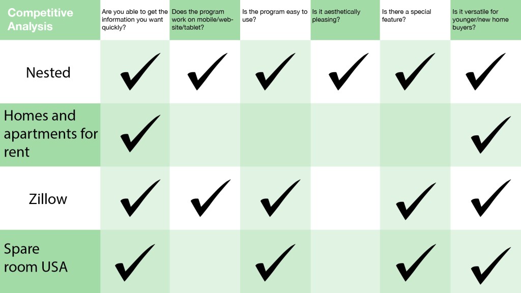
When researching for the competitive analysis we found out very quickly there are many competitors out in the market. One of the main competitors was Zillow. They already had such a large following and already so many positive reviews.Their interface also ran smoothly and made sense to use. We took inspiration from what worked in other programs and wanted to improve what did not work in others. What we noticed is alot apps or websites just stuck to being just an app or a website. Also some platforms needed you to put in a lot of information from the beginning to generate results. As this does help to create better results for the user it can be tedious if you want to see the app before putting in a lot of information. We also noticed a lot of other apps had the same design. The design did work for every app but it didn’t really have a different look to them. A lot of apps and websites did have a special feature. Not all of them did but features like distance calculators or resource pages. Most programs were easy to use unless they wanted a lot of information off the back. A lot of people may only want to put one or two things in and then narrow their search after that. Other competitors gave us a lot of inspiration on how to update our interface.
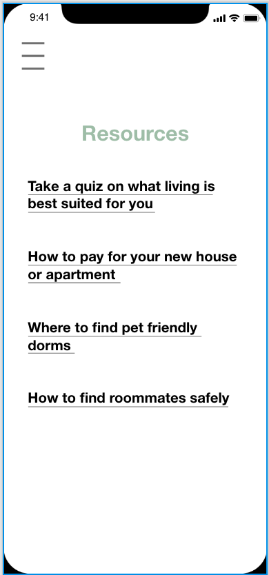
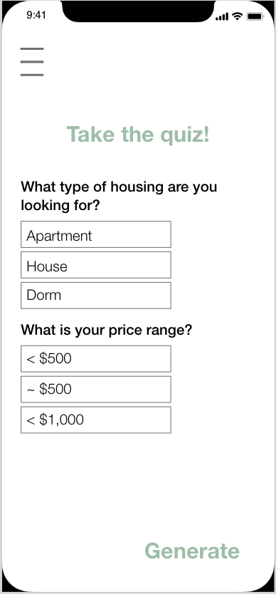
Feature design
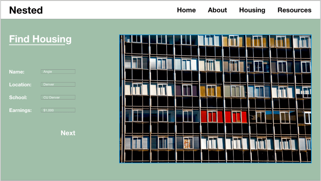
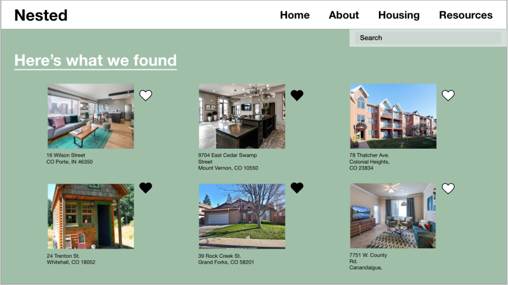
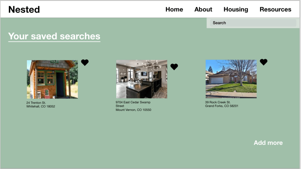
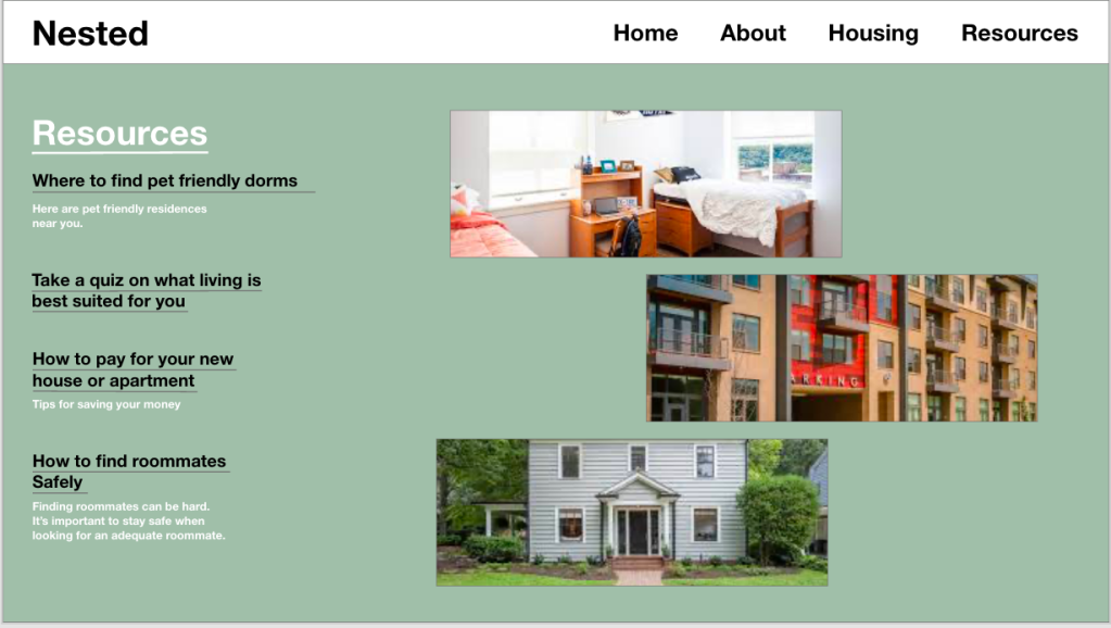
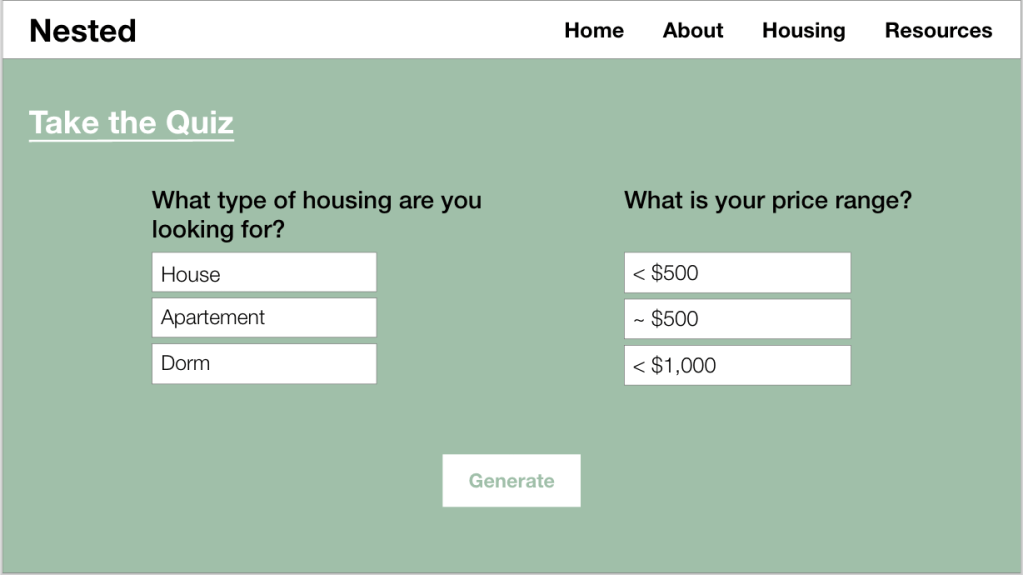
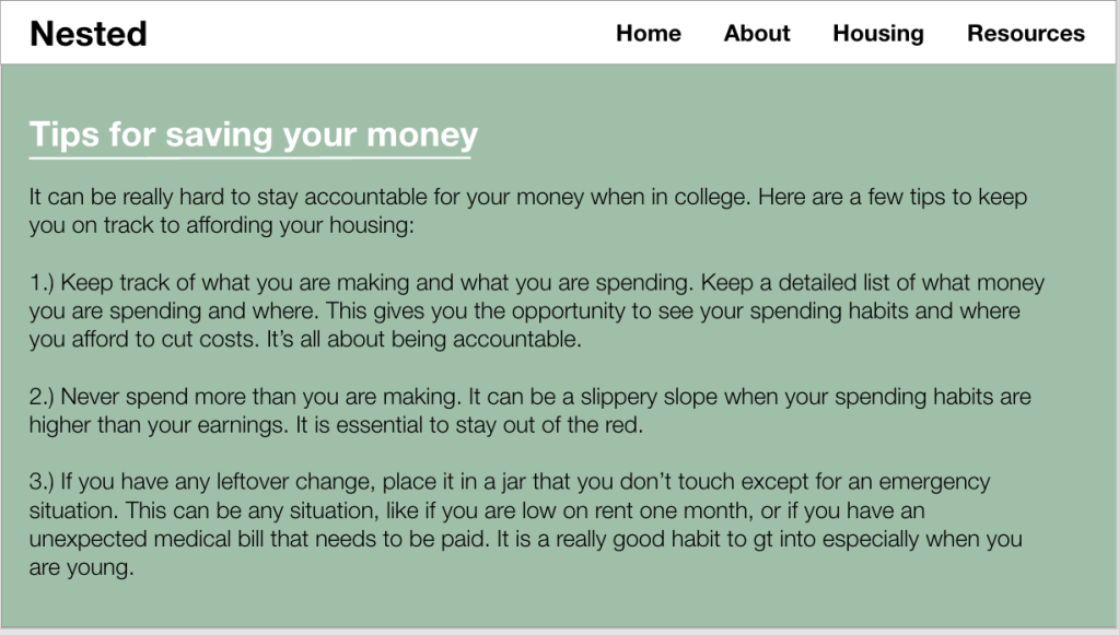
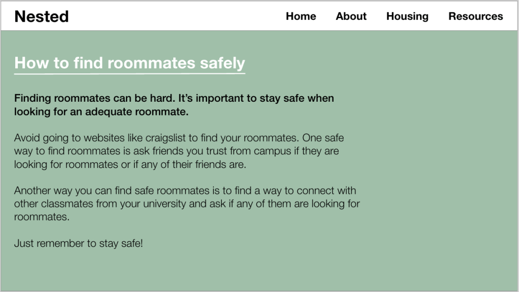
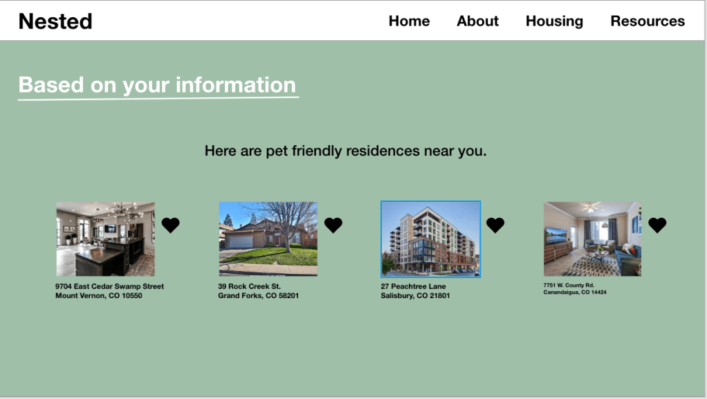
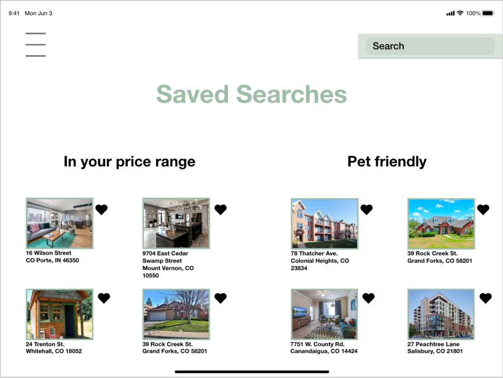
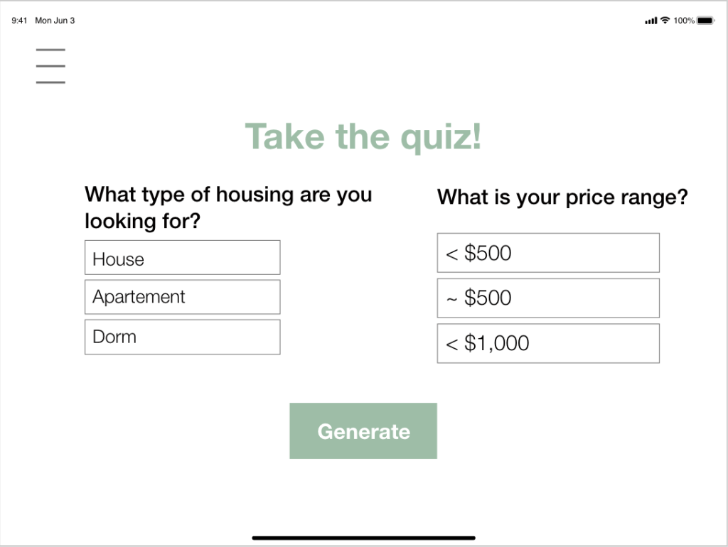
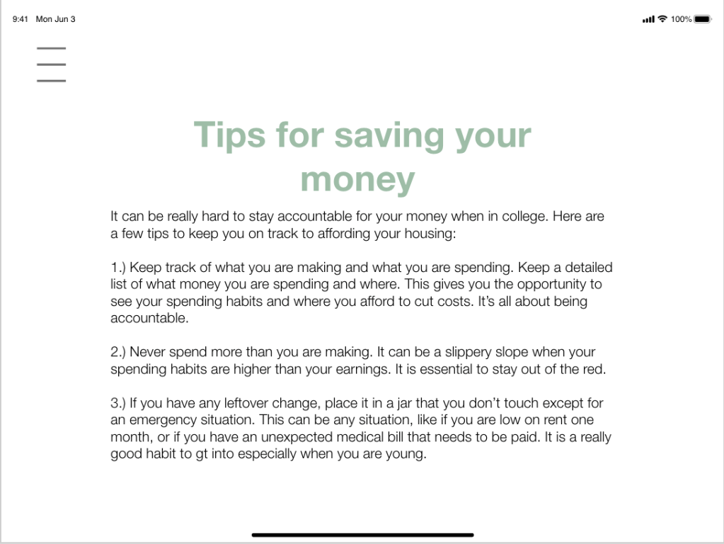
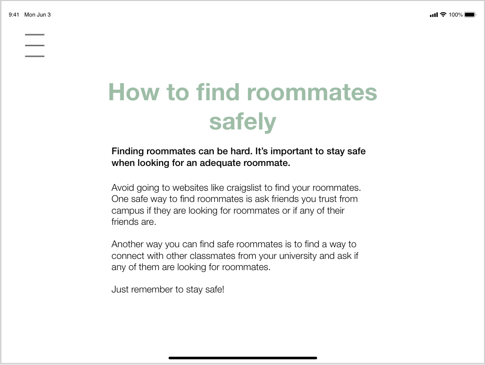
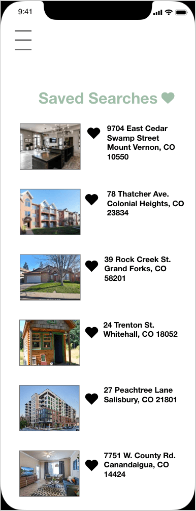
The feature design that I selected to be a part of the app was having a resource page with additional information and a saved searches part of the app. The resource page would help young buyers that are looking for housing to be able to find additional information. Since most to all people looking for housing coming to college are coming from living with their parents the additional information would be helpful. This helps my civic problem of providing additional information to new home buyers. The saved seaches page is important because it gives the users a place to compare pricing. Dalvin Brown from USA Today mentioned about 76% of young adult recent homebuyers spent less than 30% of their monthly income on housing costs in 2017, the latest data available show. That number was up from 69% in 2000 and 65% in 2009, according to Census data. People are spending a large amount of their income on housing so the saved seaches lets you save housing options and compare pricing so you can get the best deal for your money. It’s helping the civic problem of helping to find options that you prefer with the best budget in mind.
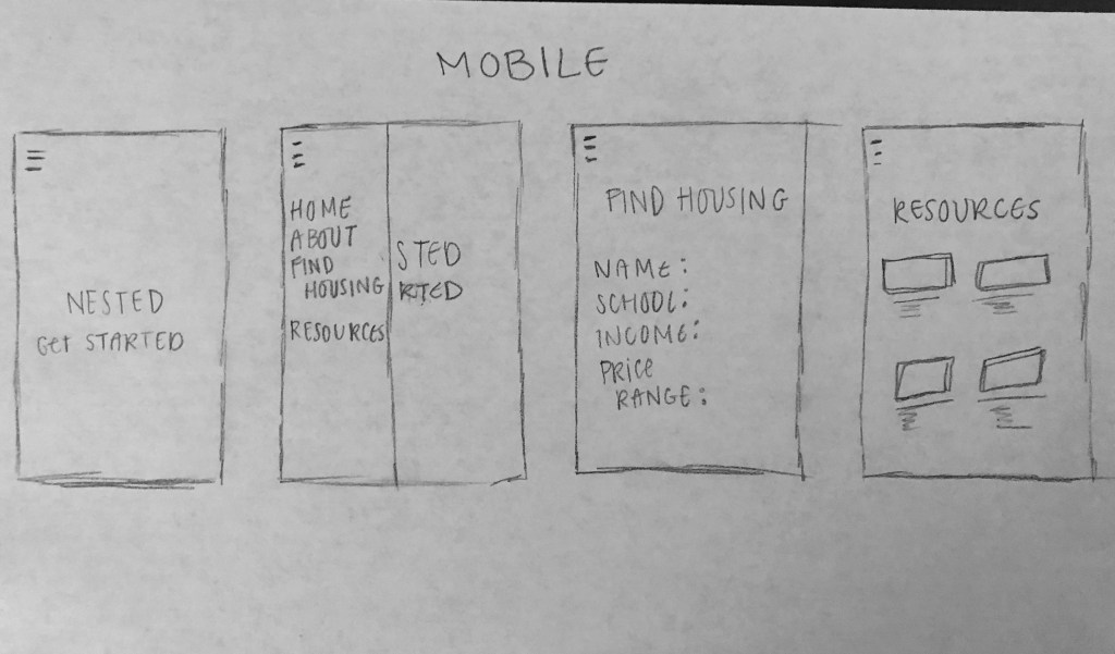
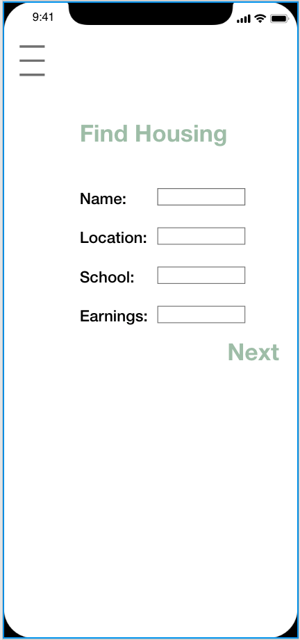
Low fidelity designs


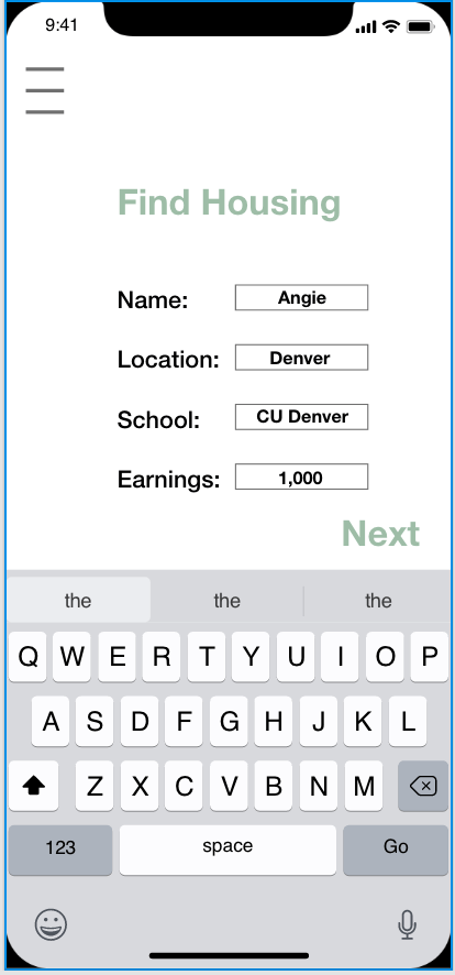
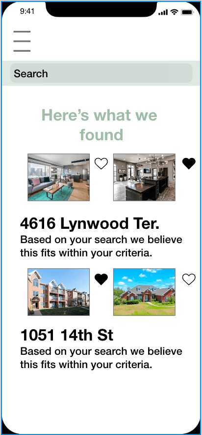
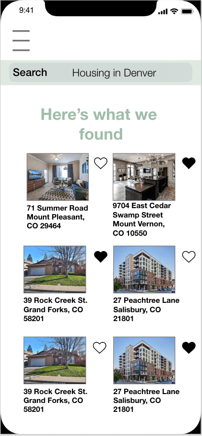
High fidelity design
Desktop
Link to the Desktop prototype:
https://xd.adobe.com/view/63bcf708-ee78-4276-5a3c-8b750da559f1-158d/
Tablet
Link to the Tablet prototype:
https://xd.adobe.com/view/77a5afe6-daa4-4ca1-54bf-607a84064b6d-0194/
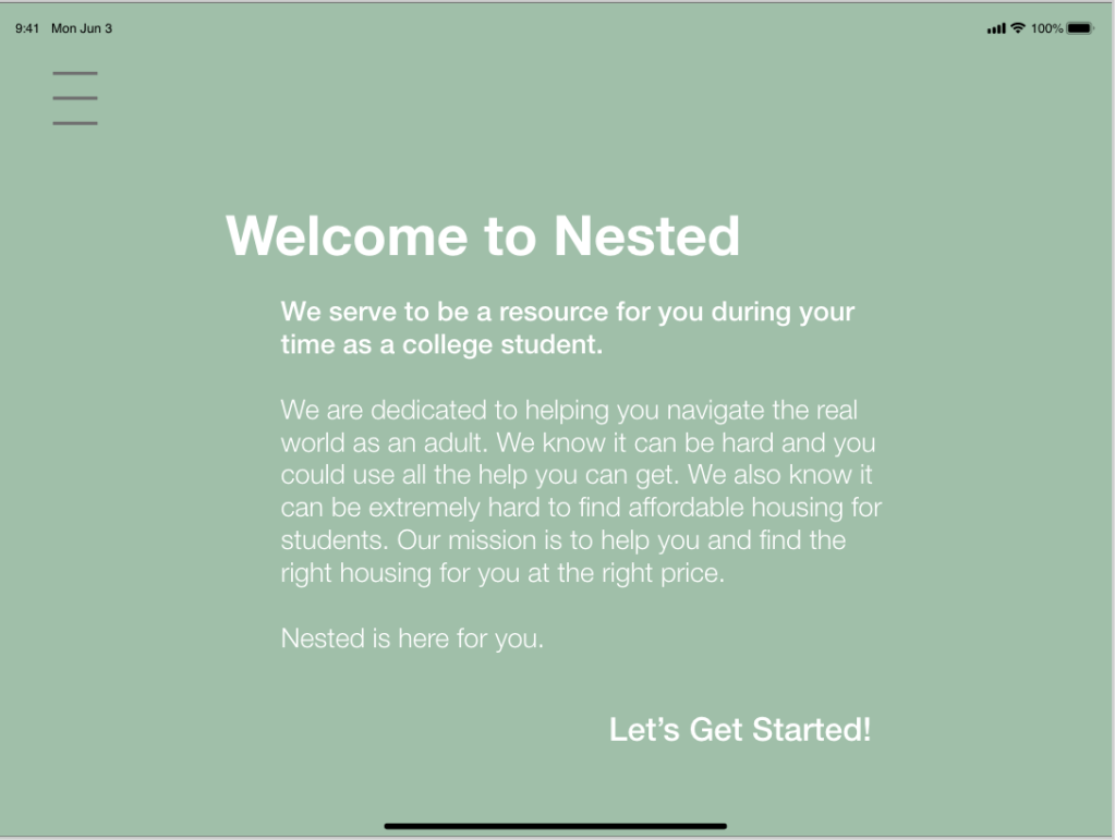


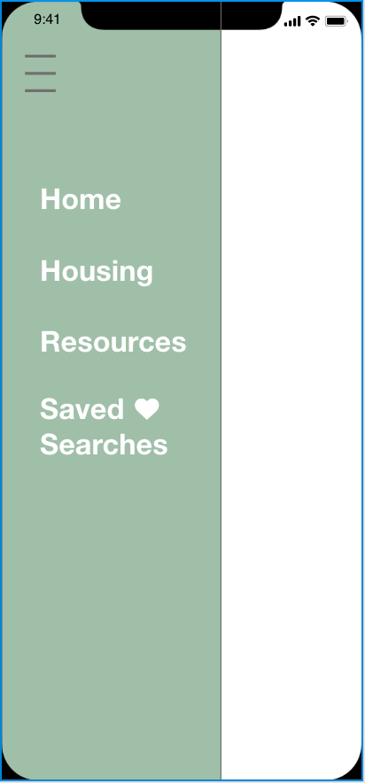
Mobile
Link to the Mobile prototype:
https://xd.adobe.com/view/e115869c-189a-4183-74bc-3eefbd6cb06e-9724/
Project retrospective
What did I find most challenging about this project?
What I found most challenging this project is just being able to meet up. We are both very busy working students and then when the COVID-19 hit campus it made it even harder. We no longer could meet face to face and we had to communicate virtually all the time. It was an interesting challenge to take on but everything else we were able to work together and get done before the virus really took effect on campus.
How was your product design affected by your research?
Our product design was affected by mostly what people are looking for in a housing app. We at first had a lot of complicated features but that did not really work out when users did not respond well to that. We learned to make our app efficient and simple so users were able to use the app with the least amount of hiccups. We also learned to expand the app to other resources and links that people can further their research in buying a place to live.
What are your perspectives on responsive design?
I think responsive design is important. Since this is a digital age it is important to have a platform look good and be able to work well on multiple devices. I feel that can really make a difference if images or information gets distorted while using a platform. It is something to take into consideration when working on an app or website.
What was the most valuable lesson I learned?
The most valuable thing I learned is how to work through something when it does not go according to plan. Me and my partner used to meet up in person to work on projects but now since the virus we can no longer do that. It is something we have never really had to deal with so it has been interesting.
